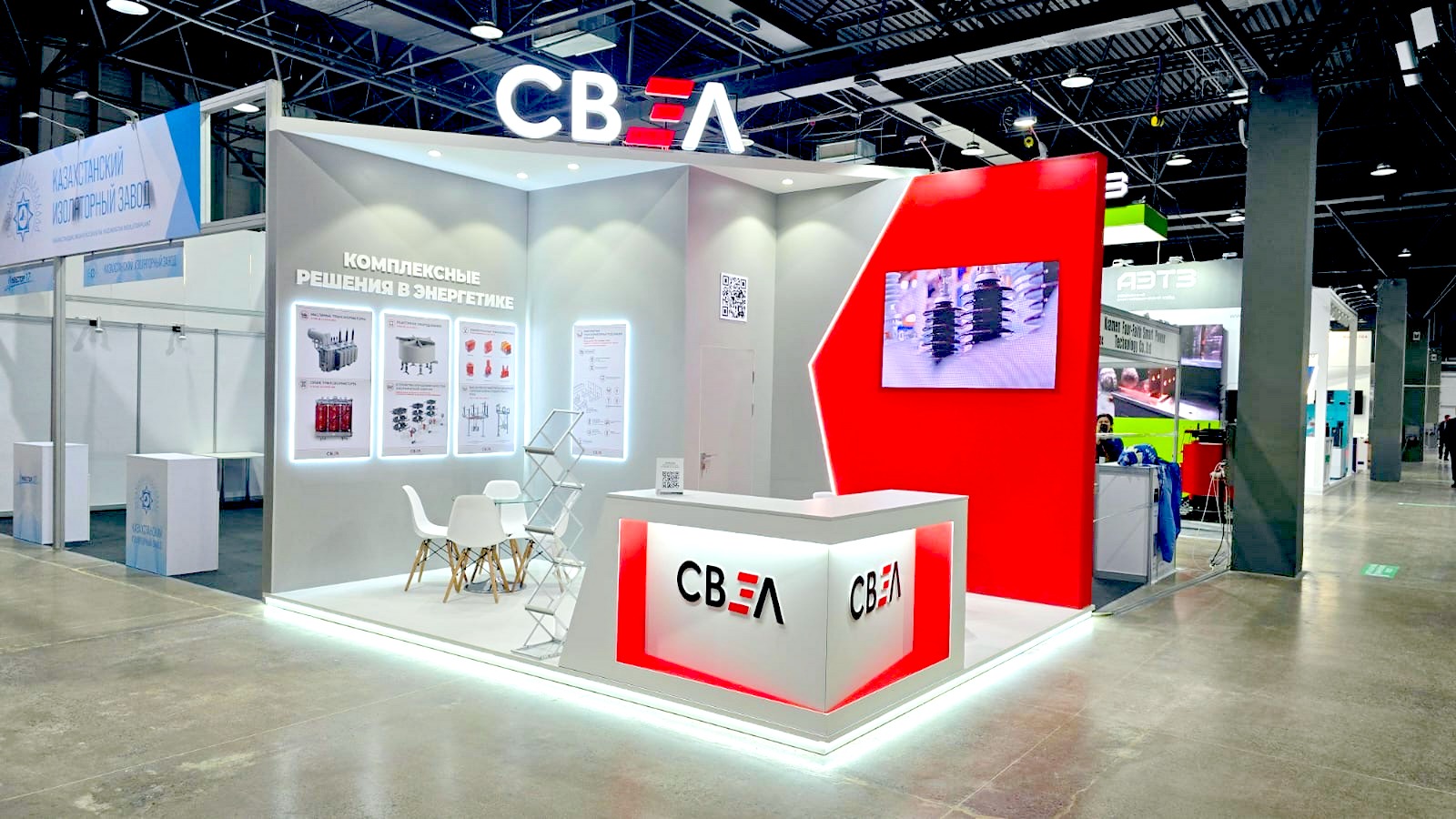
 Branding means putting a trade mark — a recognizable symbol — on products or materials of the company.
Professional advertizing can create a catchy and easily rememberable brand image, which will be strongly associated with only one owner. This allows the brand owner to distinguish his offer from competitors.
Many Western partners believe that in Russia there are lots of talented engineers, designers, inventors, scientists, and hard-working professionals, who are able to realize any idea and introduce it into production. However, there is still a problem that by far not all domestic manufacturers know how to present their product, explain what it is for and make it desirable for future users. For these reasons our specialists often lose attractive growth opportunities. Your product presentation will leave a long memory, if your fresh ideas are explained in simple terms and accompanied by bright and neat graphic images. This is especially important for entering foreign markets.
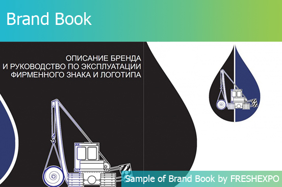
Any advertizing campaign, including participation in exhibitions, will work much better, if your company has a brand book — a brand management guide for using all elements of corporate style on various advertizing media. Order a professional brand book from FRESHEXPO specialists — the result will pay off in spades!
 Logo is a graphic mark, emblem, or symbol commonly used by commercial enterprises and organizations to aid and promote instant public recognition, strong association with activities of the owner company and its product advantages. Logo can be an image or a combination of an image and name of the company or even its short slogan.
An effective logo should be simple, memorable, timeless, versatile, and appropriate. It should help your company stand out on the background of competition and have strong positive associations — confidence in success, development, commitment to do everything possible to achieve them, high professionalism, etc. On the other hand, a good logo is intuitively perceived as a personal message to a future client and the company can highlight its importance.
At FRESHEXPO you can order development of a logo for an exhibiting company, a whole exhibition, or event. We also provide rebranding services. Today, logos are more and more often created for large events, especially taking place at international level, where it is essential to transmit ideas as clearly as possible to representatives of different cultures. Having an event logo is a good sign saying that you are making a significant step ahead.
If the effect of your participation in exhibitions is not as high as you would like it to be, or it is declining over time, our recommendation would be to order development of a logo and other corporate symbols. Get in touch with our specialists for more advice.
 Corporate font is one of the elements included on brand book. It highlights the core ideas of your corporate image: creativity and style, power and speed, luxury and eccentricity, commitment to traditions and serenity.
In logos you can see all sorts of fonts: serif and sans-serif, vertical and sloping, compact and stretched, with uppercase and lowercase letters, filled with color and outlined, simple and ornamented.
Fonts are used on all media containing texts — document forms, printed advertizing, web, wide-format products. For that reason the main requirement to fonts is high readability.
A company might have more than one corporate font. One of them will be used for logo, and the other one or two — for main text. It is important to mention here that all corporate fonts should match with each other and favor the development of a comprehensive image.
It is a popular fact that colors and their combinations influence our mood. But colors are also subconsciously associated with the most important human qualities and desires. Why is color so important? Color is the first thing we remember about a brand. Only after the color a person remembers the outlines of the logo, the creative design he had seen, product advantages and technical specifications.
Red is a symbol of power, fire and the sun, rapid movement, readiness to fight. In many traditions of the world red is the color of festivities and exclusiveness. It accentuates leadership and determination, you can often find this color in logos of the largest brands that are convinced of their exclusiveness.
For medium and small business it is advisable to combine red with some other color in order to reduce its aggression, but keep the expressiveness and recognition of the image.
Orange
It is the color of unfailing optimism, coziness, and warmth. It is one of the catchiest colors of all. However, it has a slightly light-minded shade, which should be kept in mind working on brand conception.
Yellow shares the warmth of sunlight. It is cheerful, joyous, full of life, simple, creative.
Yellow is rarely used in pure state because on white background it gives low contrast.
To make yellow more legible use it in various combinations or at least with a darker outline.
Blue color reflects calmness and ability to concentrate. It is associated with air, water, fresh wind, heavenly blessing. Blue is a cold shade. It might be a good choice for companies transporting and selling seafood, travel agencies selling sea journeys, etc.
Green is a symbol of natural power, health, amicability, it produces a relaxing action.
Green is very good in combination with yellow, blue, brown and other pastel shades.
Brown is associated with trees and ground. It means serious attitude and responsibility, simplicity and harmony with the environment. It is often chosen by construction companies and real estate agencies.
With black for a corporate symbol there is a lot of ambiguity. Black is a symbol of power, firmness, and stability. It can highlight the exclusive and elite character of your product. But if you go for black, it is important to get away from association with grief and loneliness. Logos in black should highlight confident position in the market and huge experience.
White is the color of purity and innocence. Since white is often used as background color, especially in printed materials, a logo can not be purely white. To increase contrast white is often combined with red, green, and blue.

 Branding means putting a trade mark — a recognizable symbol — on products or materials of the company.
 Logo is a graphic mark, emblem, or symbol commonly used by commercial enterprises and organizations to aid and promote instant public recognition, strong association with activities of the owner company and its product advantages. Logo can be an image or a combination of an image and name of the company or even its short slogan.
 Corporate font is one of the elements included on brand book. It highlights the core ideas of your corporate image: creativity and style, power and speed, luxury and eccentricity, commitment to traditions and serenity.


